illustration
Lane Crawford's
160 years Anniversary
Year
2010
Objective
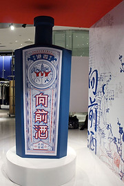
Embracing the heritage and spirit of Hong Kong, a giant Chinese medicine wine bottle which modernizes traditional crafts and ideas was created.
Concept / Process
When Friendly received the brief of Lane Crawford, she invited ChinaStylus, a local creative and advertising agency, to join project together as a team.
Jay, founder of Stylus Design (formerly known as ChinaStylus), also as the team head, has the idea to create a giant Chinese medicine wine bottle. To combining the old and new traditions, and to embed a positive meaning, a wordplaying name “Walk Forward Wine” came to Friendly's mind.
In Cantonese, the word “Wine” (酒) has a similar pronunciation as “Walk” (走). The “Walk Forward Wine” is the best medicine for those who "suffer" from the "Hong Kong typical diseases".
“Beware of the fake product” – “Money In The Eye Wine” was written at the back side of the bottle. Since “Forward” (前) sounds similar to “Money” (錢)in Cantonese, we attempt to remind the sufferers that they should prevent it and stop thinking that money is everything.
A set of ironic illustration was created by Friendly Liu, which shows six of the typical
“Hong Kong diseases” such as:
-
extreme rent
-
air pollution
-
demolition of heritage sites
-
limited space
-
working overtime
-
socialphobia
Traditional silk screen and hand-finishing techniques were applied by the whole of the ChinaStylus team.
Friendly used to work in ChinaStylus as a senior graphic designer from 2006-2008.